Introduction
First impressions matter in business. Before customers speak with your team, explore your website, or purchase your products, they may notice your storefront sign, reception signage, or exterior branding. The quality of that signage can influence how they perceive your business and the level of professionalism they associate with your brand.
While the design, colours, and typography of a sign are important, its finish can make an equally significant difference. Details such as brushed metal, polished acrylic, matte surfaces, dimensional lettering, and halo lighting can transform an ordinary sign into a sophisticated branding feature.
For businesses investing in custom signs in Calgary, selecting the right finish is an opportunity to create a distinctive appearance, strengthen brand identity, and make a space feel more professional. The right combination of materials and finishing techniques can help a sign complement your interior design, attract attention, and communicate the character of your business.
In this guide, we will explore how custom sign finishes can make a business look more premium, the different options available, and how to choose the best finish for your brand.
1. Why Sign Finishes Matter for Your Business
A sign finish refers to the final appearance and surface treatment of a sign. It can include the texture, sheen, colour, material, edges, lighting, and decorative details that determine how the finished product looks.
Two signs can feature the same logo and wording but create very different impressions because of their materials and finishes. A basic flat sign may communicate information effectively, while a dimensional acrylic sign with carefully selected lighting can create a more refined appearance.
Premium signage is not necessarily about choosing the most expensive material. It is about selecting details that work together to support your brand identity.
For example, a luxury retail store may benefit from elegant lettering, subtle metallic accents, and a clean matte background. A modern technology company may prefer smooth acrylic, crisp edges, and illuminated elements. A professional office might choose brushed metal lettering to create a confident and understated impression.
When the finish matches the business’s identity, signage becomes more than a way to display a name. It becomes part of the overall customer experience.
2. Brushed Metal Finishes for a Sophisticated Appearance
Brushed metal finishes are popular for businesses that want a professional, contemporary, and established look. Their subtle linear texture creates visual interest without relying on bright colours or elaborate graphics.
Stainless steel and aluminium are commonly used in commercial signage, depending on the application and desired appearance. Brushed finishes can work particularly well in corporate offices, professional service businesses, hotels, medical facilities, and premium retail environments.
Why Brushed Metal Looks Premium
The understated texture of brushed metal can give signage a refined appearance. It reflects light differently from a highly polished surface, creating a more restrained visual effect.
Metal lettering can also provide a sense of substance and permanence. When mounted carefully against a wall or contrasting background, individual letters create depth and help the brand name stand out.
For example, a brushed-metal company logo installed in an office reception area can create a polished focal point without overwhelming the surrounding interior.
Best Applications for Brushed Metal Signs
Brushed metal finishes are suitable for:
- Corporate reception signs
- Office building directories
- Professional service businesses
- Hotel and hospitality signage
- Premium retail storefronts
- Interior wall logos and lettering
The key is to choose a finish that complements the surrounding materials. Brushed metal can work particularly well with stone, wood, glass, neutral paint colours, and minimalist interiors.
3. Polished Metal Finishes for a Bold, High-End Look
While brushed metal offers a subtle appearance, polished metal finishes create a brighter and more reflective effect. Their smooth surfaces can catch light and make lettering or logos more visually prominent.
Polished finishes may be suitable for upscale retail environments, hospitality businesses, showrooms, and selected corporate interiors.
However, reflective materials should be used thoughtfully. Strong reflections can sometimes make signage harder to read under direct lighting or against reflective backgrounds.
The goal is to create contrast and visual interest without sacrificing legibility.
A polished metallic company name paired with simple typography can make a strong impression. Using the same finish on every surface, however, may create an overly reflective appearance. Combining polished details with matte backgrounds can produce a more balanced result.
When choosing polished metal, consider the lighting conditions, viewing distance, wall colour, and overall design of the space.
4. Acrylic Finishes for Modern Business Branding
Acrylic signage offers considerable flexibility for businesses seeking a clean, modern appearance. The material is available in clear, coloured, frosted, and opaque options, allowing designers to create different effects without changing the basic layout.
Acrylic signs are commonly used in reception areas, retail stores, showrooms, clinics, restaurants, and office interiors.
Clear Acrylic for a Clean, Contemporary Look
Clear acrylic can create a layered effect, especially when mounted slightly away from the wall using stand-off hardware. The transparent panel allows the background to remain visible while the logo or lettering becomes the main focal point.
This style works well for businesses that want a modern appearance without a visually heavy sign.
Frosted Acrylic for Understated Elegance
Frosted acrylic provides a softer, more subtle finish. It can be used for room identification, privacy-related graphics on glass, reception signage, and office branding.
Its diffused appearance can complement minimalist interiors and neutral colour palettes.
Coloured Acrylic for Strong Brand Identity
Coloured acrylic can help businesses match their signage to their brand guidelines. It can be used for dimensional letters, logos, decorative panels, and directional signs.
For a premium result, choose colours that complement the environment and maintain sufficient contrast. A carefully selected colour palette often looks more sophisticated than using too many competing colours.
5. Matte Finishes for Minimalist and Elegant Signage
Matte finishes have become a useful option for businesses seeking understated, contemporary branding. Unlike glossy surfaces, matte materials diffuse light and generally produce less glare.
This makes them suitable for offices, boutique stores, modern restaurants, studios, and professional service environments.
Matte black signage with metallic lettering, for example, can create a striking contrast. A matte white background with dark lettering can produce a clean and timeless look.
Matte finishes can also help prevent a sign from competing with other visual elements in the space. Instead of attracting attention through reflection, they rely on shape, typography, contrast, and material quality.
However, matte surfaces are not automatically maintenance-free. Some finishes may show fingerprints, oils, or scuff marks, depending on the material. Businesses should consider cleaning requirements when selecting a surface treatment for high-traffic areas.
The best matte finish combines the desired visual style with practical maintenance needs.
6. Gloss Finishes for Vibrant and Eye-Catching Signs
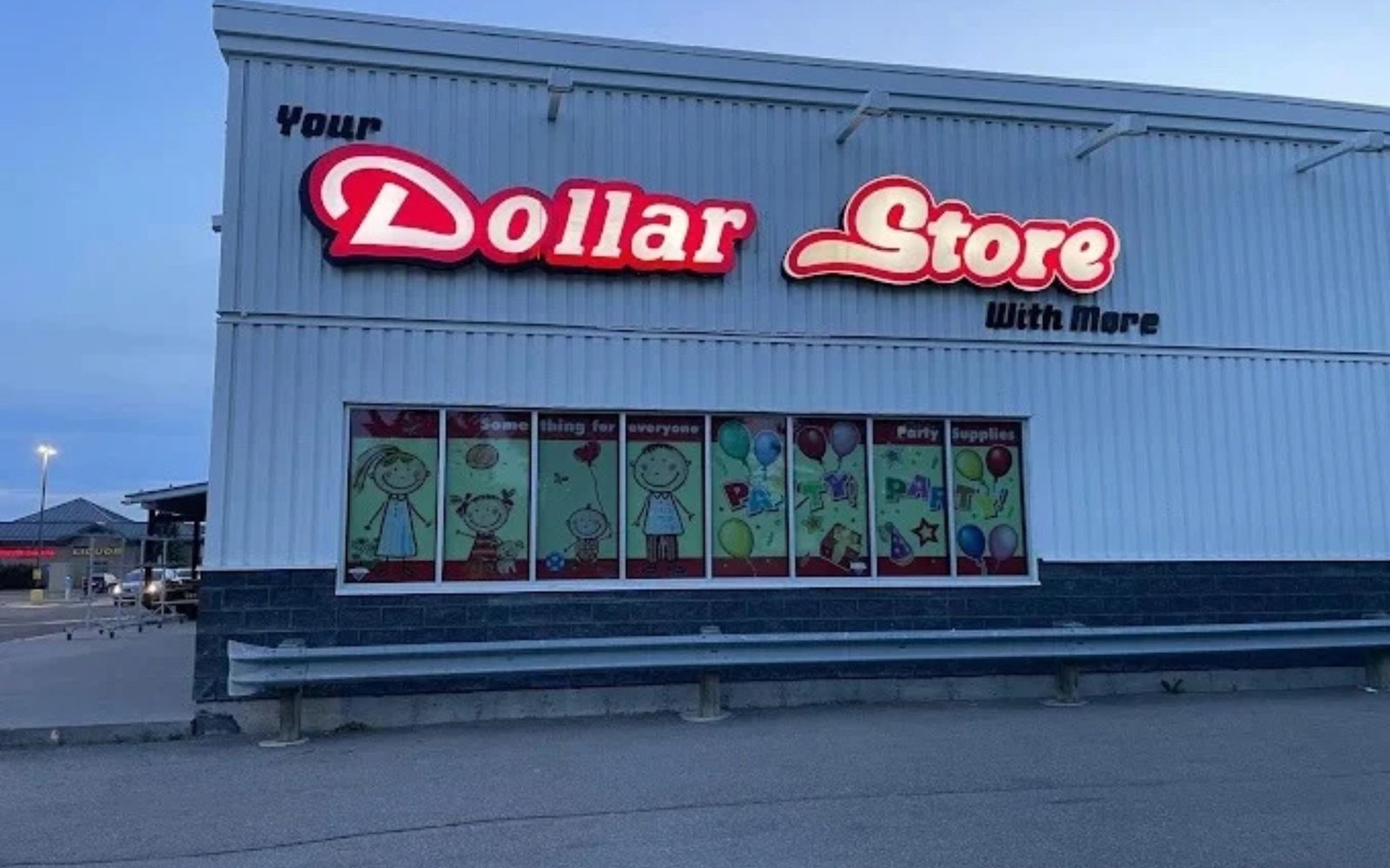
Gloss finishes create a smooth, reflective appearance that can make colours look more vibrant and graphics more prominent. They can be effective for retail displays, promotional signage, product branding, and businesses with energetic visual identities.
A glossy sign may be particularly effective when the goal is to highlight bright brand colours or create a polished, contemporary display.
However, gloss is not the best choice for every situation. Reflections from windows, overhead lights, and direct sunlight can interfere with readability. Glossy surfaces may also reveal fingerprints and surface marks more readily than some matte alternatives.
Businesses should consider where the sign will be installed before choosing this finish. A glossy panel in a controlled indoor environment may perform differently from one exposed to direct sunlight or strong overhead lighting.
For a balanced appearance, gloss can be combined with matte backgrounds or used selectively on logos and other important elements.
7. Dimensional Lettering Adds Depth and Professionalism
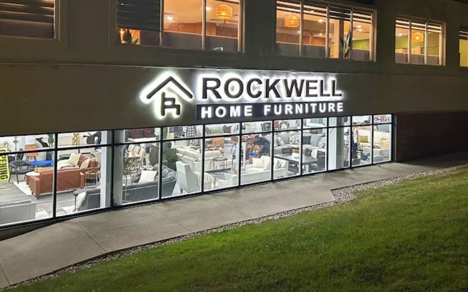
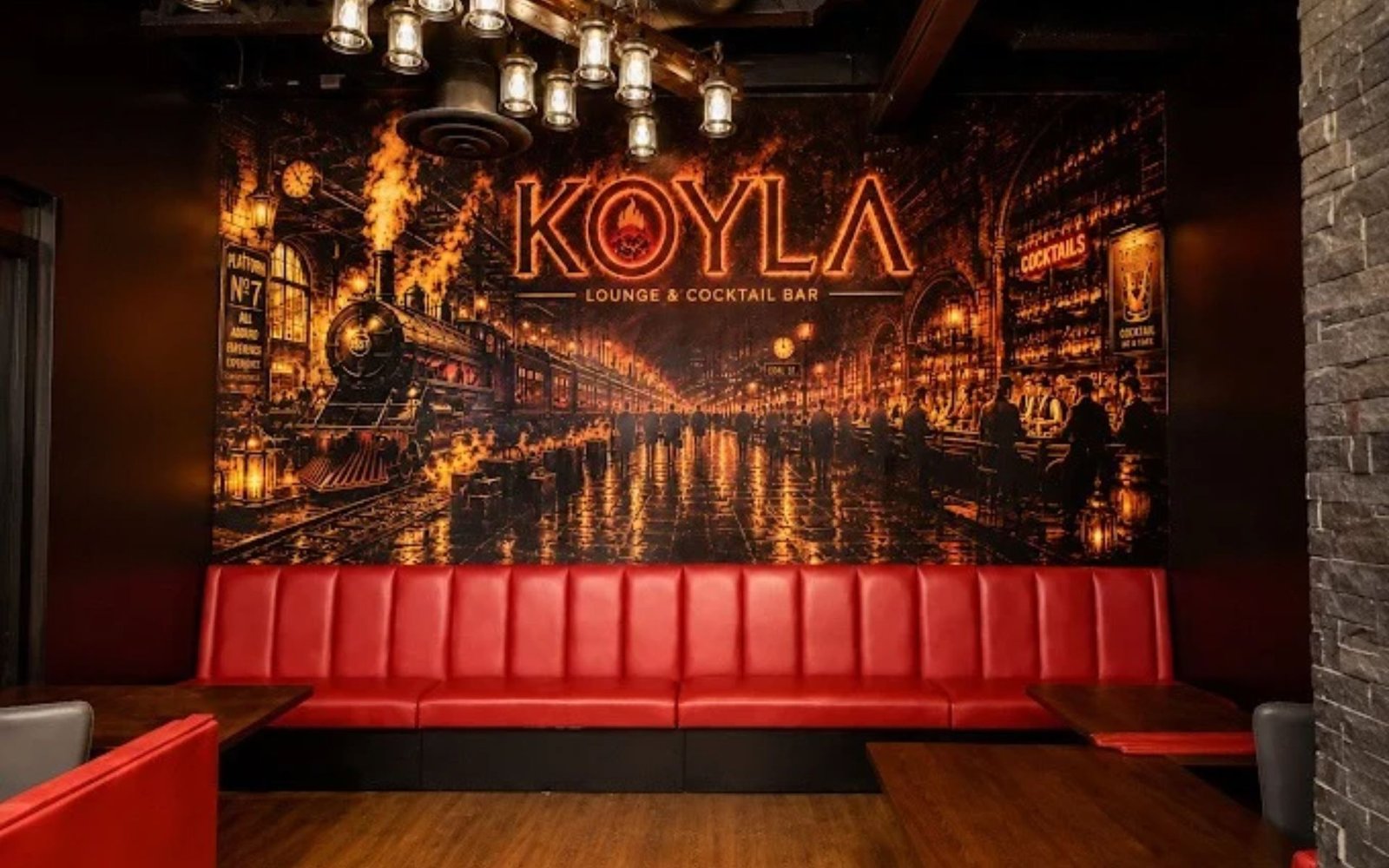
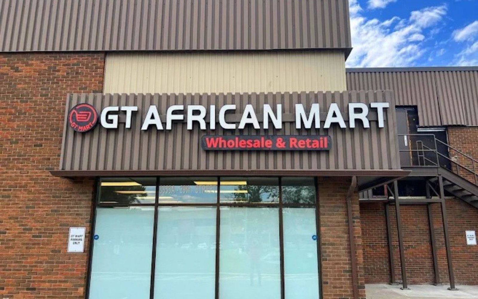
Dimensional lettering is one of the most effective ways to make business signage feel more substantial. Instead of printing the logo directly onto a flat surface, individual letters or shapes are fabricated to project from the wall.
Depending on the design, dimensional lettering can be produced from acrylic, metal, or other suitable materials.
The added depth creates shadows and highlights as lighting conditions change. This can help the business name become a prominent feature without requiring an oversized sign.
Why Three-Dimensional Signs Stand Out
Flat graphics depend mainly on colour and contrast. Dimensional lettering introduces physical depth, which can make a logo more noticeable and visually engaging.
For example, a professional office might install raised metal lettering behind the reception desk. A boutique could use dimensional acrylic letters on an interior feature wall. A showroom might use fabricated lettering to reinforce its brand identity near the entrance.
Choosing the Right Letter Thickness
Letter thickness should suit the viewing distance and scale of the sign. Letters that are too thin may not create the desired visual effect, while excessively thick letters can look heavy or out of proportion.
Spacing is equally important. Properly aligned letters with consistent spacing help create a cleaner and more professional result.
For businesses investing in premium signage, dimensional lettering can be a worthwhile design feature when it complements the brand and the space.
8. Halo-Lit Signs for a Premium Lighting Effect
Lighting can significantly influence how signage looks, particularly in reception areas, commercial interiors, and exterior storefronts.
Halo-lit signs use illumination directed behind individual letters or a logo. When installed against a suitable background, the light creates a soft glow around the edges, producing a floating effect.
This style is often associated with modern offices, hospitality venues, upscale retail stores, and contemporary commercial spaces.
What Makes Halo Lighting Different?
Front-lit signs direct light toward the viewer, making the letters themselves glow. Halo-lit signs instead create an illuminated area behind the letters.
The result is often more subtle than a bright, directly illuminated sign. It can add depth and visual interest without making the lighting the only focus.
The background, wall colour, letter spacing, and distance between the sign and mounting surface all affect the final appearance.
Halo lighting is not suitable for every environment. A very bright or unevenly textured background may reduce the clarity of the effect. Electrical requirements, installation access, and maintenance should also be considered.
When planned carefully, halo-lit lettering can give a business a distinctive and sophisticated identity.
9. Gold and Silver Accents for Premium Brand Positioning
Metallic accents can communicate elegance and exclusivity when used in the right context. Gold, silver, bronze, and champagne-toned finishes are often used for luxury retail, beauty businesses, hospitality brands, and premium product displays.
Gold can create a warm, prestigious appearance, while silver often feels cooler and more contemporary. Bronze and champagne tones may provide a softer alternative.
These effects can be achieved through suitable metallic materials, finishes, or specialized printed and applied graphics, depending on the sign design.
The important consideration is balance. Metallic details can lose their impact if they are used excessively or combined with too many decorative elements.
For example, a business might use metallic lettering on a dark background while keeping the rest of the sign simple. This creates a clear focal point and allows the finish to stand out.
Metallic finishes should also be selected according to lighting and maintenance conditions. Some highly reflective surfaces may require additional attention to remain clean and visually appealing.
10. Custom Edges, Layers, and Finishing Details
Premium signage often stands out because of small details rather than one dramatic feature.
Clean edges, carefully aligned layers, concealed mounting hardware, consistent spacing, and precise cuts can make a sign look more professionally produced.
Layered signs combine materials or panels to create depth and contrast. For example, a logo may feature raised acrylic lettering over a contrasting backing panel. A reception sign may combine a metallic logo with a clear acrylic layer.
Custom-cut shapes can also help a brand stand out. Instead of placing every design inside a standard rectangle, the sign can follow the outline of a logo or incorporate a distinctive silhouette.
However, custom shapes should remain practical. Complicated edges may increase production costs and can require additional planning for installation.
The most successful finishing details support the brand’s identity while maintaining readability, proportion, and ease of maintenance.
11. Match Sign Finishes With Your Brand Identity
A premium finish should not be selected simply because it looks expensive. It should reflect the personality of the business and the expectations of its customers.
A law firm, for example, may prefer understated metal lettering and neutral colours to communicate professionalism. A modern technology company may choose acrylic, clean typography, and subtle illumination. A boutique retail brand might use metallic accents and dimensional lettering to create a more distinctive atmosphere.
Consistency across branding is also important. Your storefront sign, reception logo, website, business cards, brochures, and other marketing materials should feel like parts of the same visual identity.
This does not mean every item must use identical materials. Instead, they should share recognizable elements such as colour, typography, logo proportions, and overall design style.
When signs align with the wider brand identity, customers receive a more consistent impression of the business.
12. Consider Durability, Maintenance, and Installation
A premium appearance should last beyond the day of installation. Material quality, surface treatment, environmental exposure, and maintenance all influence how signage performs over time.
Before choosing a finish, consider whether the sign will be installed indoors or outdoors. Exterior signs may need to withstand sunlight, rain, snow, temperature changes, and wind. Interior signs may face frequent contact, cleaning, fingerprints, or accidental impacts.
Ask your signage provider about the recommended cleaning products and maintenance schedule for the selected material. Some finishes may scratch more easily than others, while certain cleaning chemicals can damage acrylic, printed graphics, or protective coatings.
Installation also matters. Even high-quality materials can look unprofessional if the sign is uneven, poorly aligned, or mounted with visible hardware that conflicts with the design.
Professional measurement, suitable mounting systems, and careful installation help preserve the intended appearance.
For businesses in Calgary, local weather conditions should be considered when selecting exterior sign finishes and mounting hardware. A finish designed for indoor use may not be appropriate for a storefront exposed to harsh seasonal conditions.
13. How to Choose the Right Premium Sign Finish
Before placing an order, consider the following factors:
Brand personality: Decide whether your business should appear modern, elegant, bold, traditional, or minimalist.
Installation location: Assess the lighting, wall surface, viewing distance, and surrounding interior or exterior design.
Material requirements: Compare acrylic, metal, and other suitable materials based on appearance, durability, and maintenance.
Readability: Ensure that the finish, colours, and lighting do not make the business name or message difficult to read.
Budget: Consider the total project cost, including fabrication, custom finishing, mounting hardware, and installation.
Long-term maintenance: Ask how the sign should be cleaned and what conditions could affect its appearance.
Design consistency: Ensure the finished sign complements the website, logo, printed materials, and other brand assets.
Reviewing these points before production can help prevent costly revisions and ensure that the final sign supports your business goals.