Introduction
Your business sign is often one of the first things customers notice when they visit your location. It helps people identify your company, recognize your brand, and understand what your business offers. However, even a well-established brand can start to look outdated when its signage becomes faded, damaged, poorly illuminated, or inconsistent with modern design standards.
The good news is that updating an old business sign does not necessarily mean changing your company name, logo, or brand identity. In many cases, a carefully planned signage upgrade can give your business a fresh, professional appearance while preserving the recognition you have built over the years.
For businesses considering custom signs in Calgary, modernizing existing signage can be an effective way to improve visibility, enhance curb appeal, and maintain a consistent brand image without undertaking a complete rebranding project.
From replacing outdated lighting and refreshing colours to upgrading materials and introducing dimensional lettering, there are several ways to make an old sign look contemporary without losing its original identity.
In this guide, we will explore practical strategies for modernizing business signage while keeping your established brand intact.
1. Assess Your Existing Business Sign
Before making changes, evaluate your current sign to determine what needs improvement. An older sign may still have a recognizable logo and effective layout, but its materials, lighting, or overall condition may no longer meet your business needs.
Start by examining the sign from different distances. Look at it from across the street, from the parking lot, and from the main entrance. Consider whether customers can easily identify your business and read the information displayed.
Check for faded colours, peeling graphics, damaged panels, rust, outdated lettering, and uneven illumination. If the sign includes a phone number, website, or service description, confirm that the information is still accurate.
You should also assess the sign’s structural condition. Loose mounting hardware, corrosion, water damage, or electrical problems may require professional attention before cosmetic upgrades can begin.
Create a list of the elements that should remain and those that need improvement. For example, you may want to preserve your existing logo and brand colours while replacing faded lettering, improving contrast, and installing more efficient lighting.
This assessment helps you focus your budget on meaningful improvements rather than replacing everything unnecessarily.
2. Keep Your Logo and Brand Identity Consistent
One of the simplest ways to modernize an old sign without rebranding is to retain your existing logo and recognizable brand elements.
Customers may already associate your logo, company name, and colours with your products or services. Changing these elements without a clear reason can make it harder for returning customers to recognize your business.
Instead, focus on presenting the same brand elements in a cleaner, more contemporary way.
For example, an older sign may display your logo on a faded background with several decorative borders. Updating the background, simplifying the layout, and improving spacing can make the same logo feel more modern.
If your logo contains small details that are difficult to read from a distance, a professional designer may recommend adjustments to the sign layout or reproduction method. Any changes should preserve the logo’s recognizable features and follow your existing brand guidelines.
The objective is not to redesign your company. It is to make your established identity look its best in a physical environment.
3. Refresh Faded Colours Without Changing Your Brand
Colour is one of the most noticeable features of business signage. Over time, sunlight, weather exposure, dirt, and general wear can make even a well-designed sign look old.
Refreshing the original colours can create an immediate improvement without changing your brand identity.
Start by comparing the sign’s current appearance with your official brand colours. If the sign has faded, the colours may no longer accurately represent your business.
Replacing faded panels, updating printed graphics, or applying suitable new finishes can restore the intended appearance. A professional sign provider can help match colours as closely as practical across the selected materials and printing methods.
Contrast should also be reviewed. Your business name needs to stand out clearly against the background, especially when customers view the sign from a moving vehicle or across a busy parking lot.
For example, a dark logo on a light background may provide better readability than a combination of similar shades. The best solution depends on your existing brand palette and the surrounding environment.
A colour refresh can make a sign look cleaner and more vibrant while keeping the company’s visual identity familiar.
4. Upgrade Old Lighting to Modern LED Technology
Outdated lighting can make a business sign appear tired, particularly when bulbs flicker, illumination is uneven, or the sign becomes difficult to read after sunset.
Upgrading the lighting is one way to modernize an existing sign without changing its design.
LED lighting is widely used in commercial signage because it can provide consistent illumination and may reduce energy consumption compared with older lighting systems, depending on the existing equipment and the replacement design.
There are several ways to incorporate LED technology into an existing sign.
Replace Outdated Illuminated Components
If your sign already contains lighting, a qualified sign professional can assess whether the existing system can be upgraded. Depending on the sign’s construction and condition, replacing older components may improve brightness and consistency.
Add Backlighting or Halo Illumination
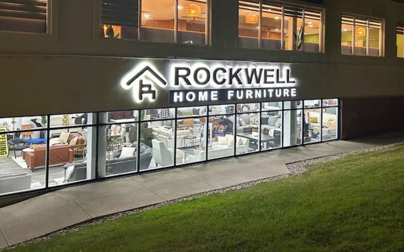
For suitable dimensional signs, backlighting can create a subtle glow around individual letters. This can introduce a contemporary appearance without changing the company name or logo.
Improve Lighting Distribution
Some signs have bright spots, dark areas, or uneven illumination. Improving the placement and distribution of light can make the sign easier to read and create a more polished appearance.
Before upgrading lighting, confirm that the sign structure, wiring, power supply, and mounting system are suitable. Electrical work should be handled by qualified professionals, and any required permits or approvals should be obtained.
5. Replace Flat Graphics With Dimensional Lettering
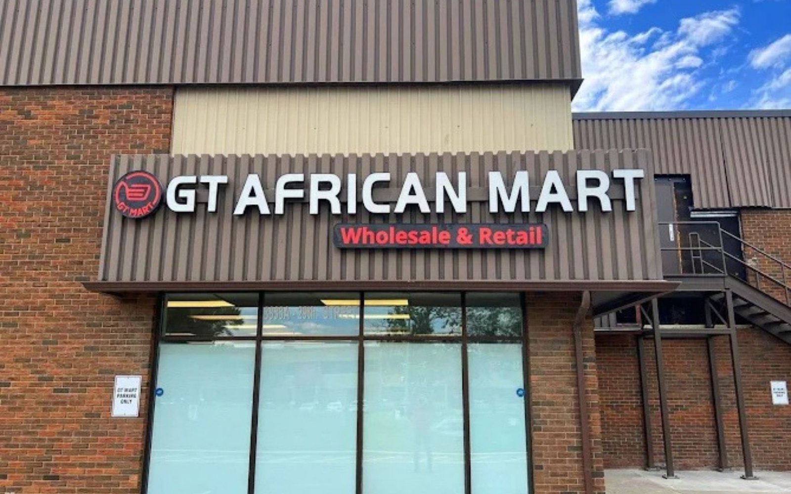
If your existing business sign uses flat printed lettering, adding dimensional elements can make it appear more substantial and professional.
Dimensional lettering consists of raised letters or logo elements that extend from the sign’s background. Depending on the desired appearance, these elements can be made from acrylic, metal, or other suitable materials.
The physical depth creates shadows and highlights that change with the surrounding light. This can help the business name stand out without requiring a larger sign.
For example, a company that currently uses a flat panel above its entrance could retain the same logo while replacing the printed lettering with raised acrylic letters. A professional office might choose metal lettering for a more understated appearance.
Dimensional lettering can also be combined with an existing sign structure, provided the structure is in suitable condition and can safely support the new elements.
This approach works particularly well for reception areas, retail storefronts, professional offices, and commercial buildings where the sign contributes to the overall customer experience.
6. Modernize the Sign Materials and Finish
The materials used in a sign strongly influence its appearance. Older signs may rely on faded printed panels, worn plastic lettering, or finishes that no longer complement the building.
Replacing selected materials can create a modern look while keeping the original design intact.
For example, an outdated sign panel might be replaced with a clean, contemporary surface that uses the same brand colours. Worn lettering could be upgraded to acrylic or metal. A dated glossy finish could be replaced with a suitable matte surface for a more understated appearance.
Popular signage materials include:
- Acrylic: Offers a smooth, modern appearance and works well for dimensional lettering and interior signs.
- Aluminium: Provides a lightweight option for many commercial sign panels and can be finished in different colours.
- Metal lettering: Can create a refined, professional look for corporate and commercial environments.
- Vinyl graphics: Can refresh existing suitable panels or glass surfaces with updated printed or cut graphics.
- Composite sign panels: May provide a clean, rigid surface for selected commercial applications.
The right material depends on where the sign will be installed, how long it needs to last, the local weather conditions, and the required maintenance.
For outdoor signs in Calgary, material selection should account for sunlight, wind, snow, moisture, and seasonal temperature changes. A sign professional can recommend options suited to the installation environment.
7. Simplify the Layout and Improve Readability
Some older business signs contain too much information. They may include several service lists, multiple phone numbers, decorative borders, small text, and outdated promotional messages.
Even if the information is accurate, a crowded layout can make the sign difficult to understand quickly.
Modernizing the layout does not require changing the brand. Instead, prioritize the most important information and remove unnecessary clutter.
The business name should be prominent. A logo or recognizable brand symbol should be easy to identify, while a short service description can help customers understand what the company offers.
Contact information should be included only when it serves a clear purpose. For example, a website may be more useful than several lines of small text on a large exterior sign.
Use readable typography and sufficient spacing between design elements. Avoid placing important words over complicated backgrounds or using colours with insufficient contrast.
A simpler layout can make the existing brand look more contemporary and improve readability from different viewing distances.
8. Update Storefront Signage to Match Your Building
A business sign should complement the building where it is installed. An older sign may have been appropriate when the property was first developed, but renovations, new exterior finishes, or changes to the surrounding commercial area can make it look out of place.
Review how your sign interacts with the building’s architecture. Consider the wall colour, windows, entrance, exterior lighting, and nearby businesses.
You may be able to modernize the sign by changing its proportions, improving its mounting, updating the background panel, or selecting a finish that complements the existing façade.
For example, a storefront with a recently updated exterior may benefit from cleaner lettering and a simpler sign panel. A commercial building with brick or stone features may suit dimensional metal letters that create contrast without covering too much of the façade.
The goal is to create a cohesive appearance between your sign and the property while preserving your established brand.
Before changing the sign’s size, position, lighting, or structure, check applicable property-owner requirements and local signage regulations.
9. Improve Window Graphics Without Changing Your Brand
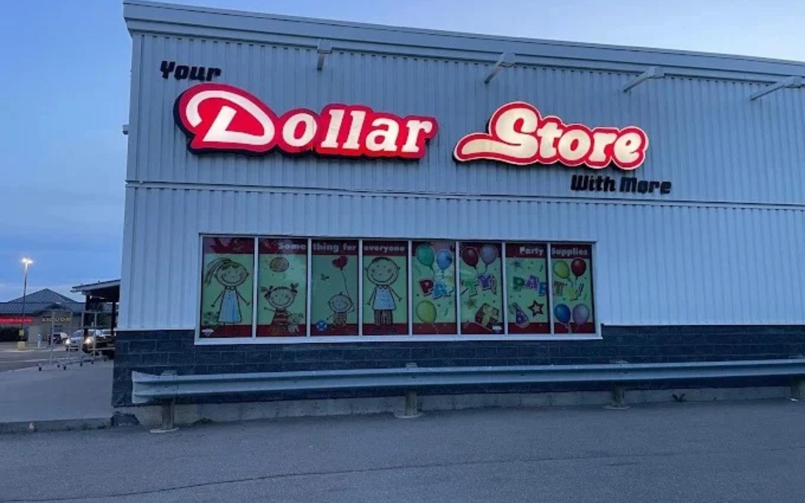
Your main exterior sign is not the only branding feature that can make a business look outdated. Faded window graphics, peeling decals, and cluttered glass displays can also affect the overall impression of your premises.
Refreshing window graphics can modernize your storefront while keeping your logo and brand colours consistent.
Consider removing outdated promotional stickers, replacing damaged vinyl, and reorganizing the information displayed on the glass. A clean layout can make the entrance look more professional and help customers understand what the business offers.
Depending on your needs, options may include cut vinyl lettering, printed graphics, perforated window film, or frosted designs.
Retail stores may use window graphics to communicate opening hours, highlight selected products, or display a short brand message. Professional offices may prefer subtle lettering and privacy-focused frosted graphics.
Ensure that window graphics do not interfere with required visibility, safety features, or applicable regulations.
When window graphics and exterior signs use consistent colours, typography, and logo placement, they reinforce the same brand identity.
10. Consider a Partial Sign Upgrade Instead of Full Replacement
Replacing an entire sign is not always necessary. If the structure remains safe and the design is still effective, a partial upgrade may provide a more practical solution.
Depending on the sign type, a professional may be able to replace the face panel, update the lettering, repair selected components, refresh vinyl graphics, or upgrade the lighting.
For example, a business with a faded sign cabinet may only need a new sign face and an assessment of the lighting system. Another business may retain the existing panel while replacing damaged lettering with new dimensional elements.
Partial upgrades can reduce material waste and may lower costs compared with complete replacement. However, the existing sign must be suitable for refurbishment. Severe structural damage, outdated electrical components, or significant deterioration may make replacement the safer long-term option.
Ask your sign provider to compare refurbishment and replacement options. The recommendation should consider the sign’s condition, expected lifespan, appearance, safety, and total cost.
11. Maintain Consistent Branding Across All Business Materials
Modernizing your business sign provides an opportunity to review how your brand appears across other customer touchpoints.
Your storefront sign, reception signage, window graphics, business cards, brochures, vehicle graphics, and website should look like parts of the same company.
You do not need to redesign all these materials at once. Instead, use the signage upgrade to confirm that the correct logo, colours, typography, and contact information are being used.
If your website has recently been updated, compare its visual style with your physical signage. A sign that uses an outdated logo or old contact details may create confusion, even if the rest of your marketing looks modern.
Consistent branding helps customers recognize your business in different settings. It also creates a more organized and professional impression.
For businesses operating multiple locations, documenting the approved sign specifications can make future upgrades easier and help maintain a consistent appearance across every property.
12. Understand Costs, Permits, and Installation Requirements
The cost of modernizing a business sign depends on its size, materials, condition, lighting, design complexity, and installation requirements.
A simple graphic refresh may cost less than replacing dimensional lettering or upgrading an illuminated sign. Structural repairs, electrical work, access equipment, and installation labour can also affect the final price.
Before requesting a quote, gather photographs of the existing sign, its approximate dimensions, and information about the building and installation location. Explain which elements you want to preserve and which need improvement.
Ask the sign provider to outline the proposed materials, lighting, fabrication, installation, and any exclusions. If refurbishment is an option, request a comparison with full replacement.
You should also check whether landlord approval, building permits, electrical permits, or municipal sign approvals are required. Requirements depend on the sign type, property, and location.
Planning these details early can help prevent delays and unexpected expenses.